Client
METRO, as part of Digital Shapers 2018
Team
1 developer, 2 data scientists, 1 designer, 1 business person
Role
Researcher, UX/UI designer
Timeframe
February – April 2018
The challenge
Digital Shapers was a 12-week competition organized by world-known corporations like McKinsey, SAP and Airbus. The task for my team was to develop a new digital business idea for METRO, "using Artificial Intelligence to build a personalized travel service". As part of the project, we had to come up with an idea, build a prototype and define a valid business model. We pitched TravelPal at the end of the competition in front of reporters from leading German newspapers and board members of the hosting companies.
Our approach
My team and I had to turn a very broad brief into a specific idea. To do that, we first defined a user group before researching the needs and wishes of that group. We decided to focus on millennials because we found that they were most likely to plan their trips via a mobile app. I was responsible for building an interactive prototype of our product, while the rest of my team worked on the data model and the business model. On this page, I will focus on the research and design process.
Process
Establishing requirements
Interviews, Insight generation and clustering, Competitor analysis
Prototyping
Paper prototype, User flow diagram, Chatbot prototype, High-fidelity prototype
UI design
Design guide, Logo
Final solution
Interactive prototype
Establishing Requirements
Once we decided we want to focus on millennials, my team and I started the design process by conducting semi-structured interviews to find out how the user group plans their travels today and what their pain points are. The whole team was involved in finding and defining a product vision and every one of us was conducting interviews. My team was working remotely which was a novel situation for me and as the only researcher/designer, I was responsible that our interviews would lead to useful insights. This is why I designed and described a whole process with the goal to get from conducting the interviews to prioritizing what our product would do. This process can be summarized in the following steps:

- Turn the interview in a set of small, descriptive statements of a user's behaviour
- Create an insight statement for each descriptive statement, aka our own interpretation of why this is happening
- Cluster similar insights
- Define an overall theme for each insight cluster
We collected 92 insights from our interviews which we boiled down to roughly 20 clusters. This was still too much for a minimum viable product and in addition, some of the statements were contradictive. We decided that the easiest solution to this would be if we voted on the pain points we regarded as the ones that "hurt" our users the most. The following insights got the most votes:
- People would like to have an authentic experience of the city and local customs
- Finding new and undiscovered places on travels is really important
- What people are really looking for is information that is directly linked to their interests and activities
- People find the information currently available too much and overwhelming
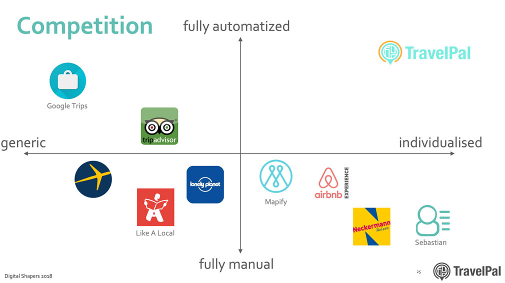
As part of our market research, we did a competitor analysis and displayed the ones we identified on an x-y-diagram. I am mentioning this here because it supported our findings from the user research: Even though there are many travel apps and guides available, no solution is both highly personalized and to a high degree automized (= time-saving).
Prototyping
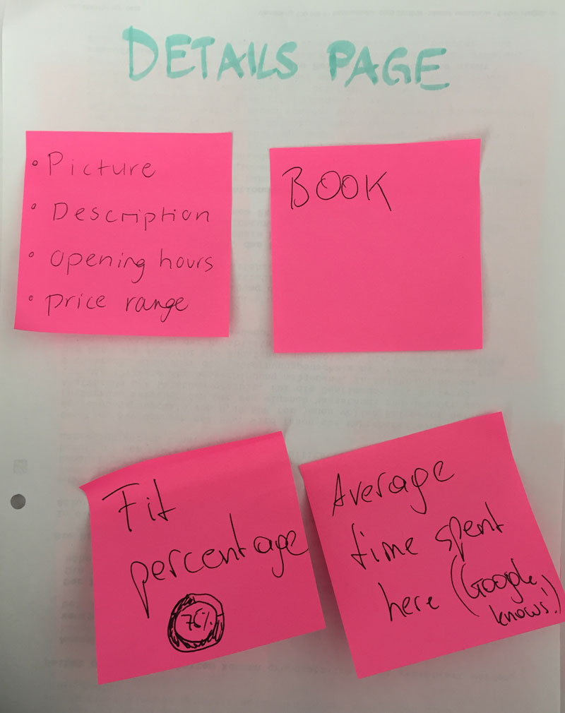
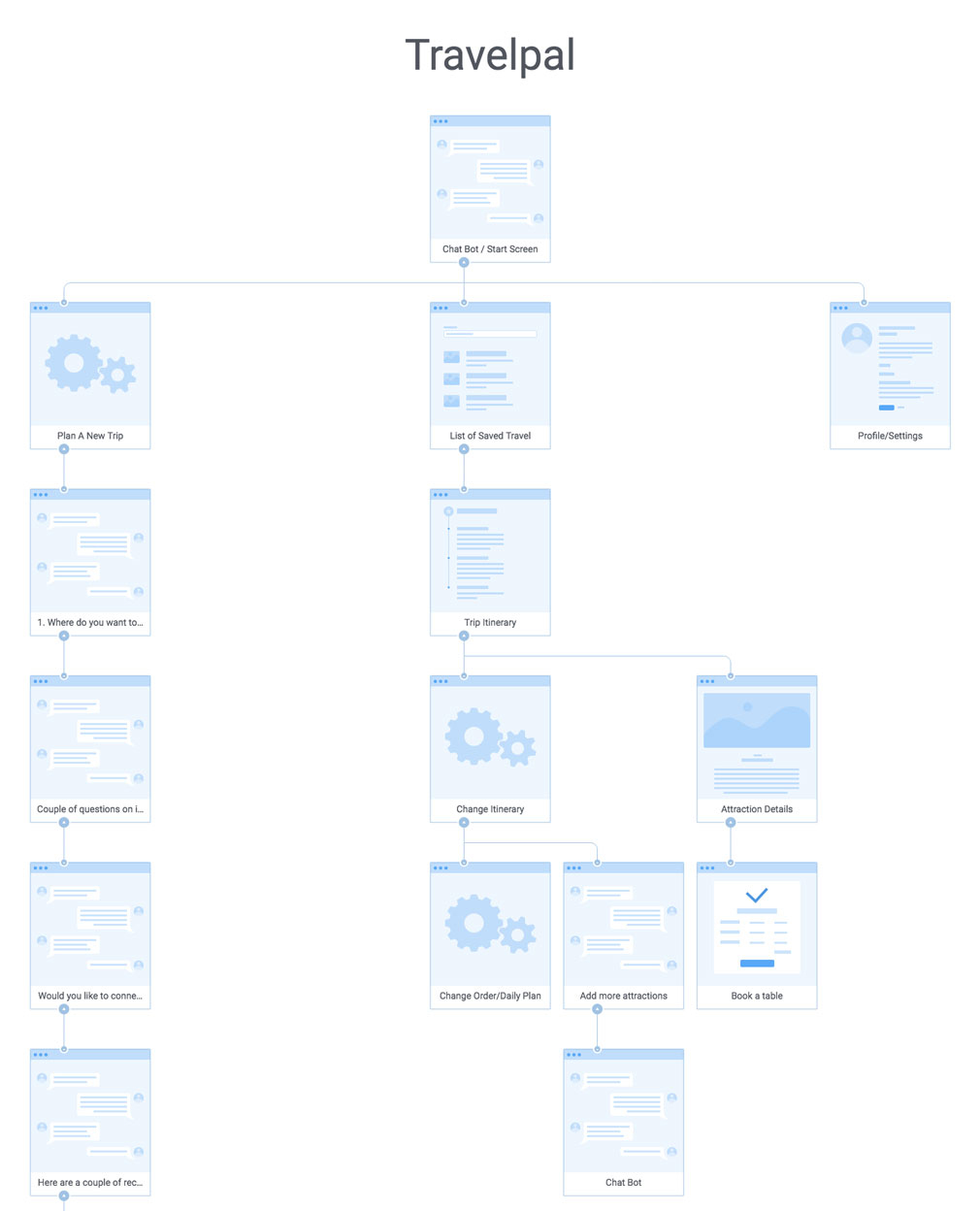
We started the product development process by sketching initial ideas and building several paper prototypes. For example, we defined the main screens we would need and used post-its to add all the functions we deemed as necessary. In the early stages, we were iterating a lot, based on feedback from our mentors and individuals from our user group. Below, you can see one of the early stage flow diagrams I created to get a better overview of the service and its individual functions. Creating such a flow diagram helped me not only to build the later prototype but also to communicate product details to my group members and other stakeholders. It also takes less time to change than a paper prototype or wireframes.
To meet both the user needs "time" and "personalization", we finally decided to build a chatbot that helps the user planning their trip. Prototyping a chatbot proved to be a challenge since it is complicated to prototype the logic of the bot in a common prototyping tool. We, therefore, decided to build two prototypes. Both of them were used in the final presentation to demonstrate TravelPal:
- A chatbot prototype based on the chatbot builder Flow XO showing the logic of the bot
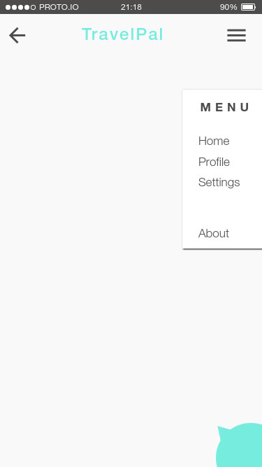
- A high-fidelity prototype without intelligence, showing the look and feel as well as the other app functions using the prototyping tool proto.io
Apart from showing the interactions, a lot of work went into designing the conversation of the chatbot, since for the recommendation algorithm to work, the chatbot had to learn as much as possible about the user but we also wanted the user to have access to recommendations as fast as possible. In the version we pitched, we decided to only include the minimum required questions to create the first itinerary, with many options for the user to exchange items or to go back to the chatbot and to answer more questions.
UI design
In addition to the user experience, I developed a visual identity for TravelPal, since we wanted to pitch an appealing-looking product and not "just" wireframes. Research furthermore shows that aesthetic designs are preferred over designs that are less beautiful, but more user-friendly. Given the limited timeframe, I therefore decided to invest some time in the UI instead of perfecting the user experience.
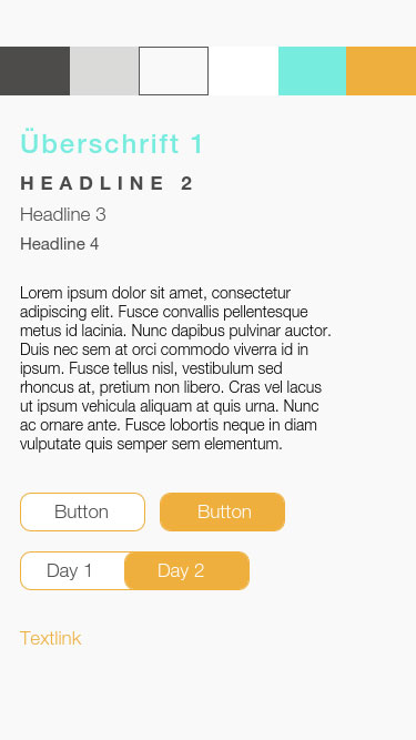
Below you see the design guide I created for TravelPal as a template for fonts, buttons and the chat interactions. As you can see, I chose grey as a base colour with yellow and mint as highlights, to give the app a fresh look and feel, appropriate for the user group.
The logo for TravelPal is shown above. It is a combination of a speech bubble, a location pin and a map. Together they create a visual representation of the travel service TravelPal.
Final Solution
The final interactive prototype I built in proto.io, you can see a video of it on the right. In the chatbot, the user enters trip details and preferences, before the app automatically creates a trip itinerary of things to do. The user can modify the itinerary, learn more about the individual items or book attractions and reserve tables for restaurants right in the app. If I were to build this prototype again, I would use less duplicate content and blind text, because this could be irritating in a user test.
What I learned
To understand our users, we followed a highly methodical research process that resembled thematic analysis, an analysis form in scientific qualitative research, which I learned about one year after the project during my Master's degree. For a project like this, a "leaner" approach might have been more appropriate. For me as an individual researcher however, I learned a lot about communicating research methods and results back to team members that are not designers and taking responsibilities for research outcomes.
It was very interesting and challenging to prototype a chatbot in a standard prototyping tool. Since many interactions are necessary, prototyping these was very work intensive. Furthermore, I could not really prototype the "intelligent" and "personalized" aspect of the prototype, which makes it hard to really test the hypothesis that users prefer personalized information and are willing to give up their data for it. I think this is always a risk when prototyping highly complex applications. I recently stumbled across a tweet that sums this problem up:
Is there a term for the scenario wherein some product goes to user testing, but it wasn’t built to a high quality/to spec, so research (likely falsely) finds the product isn’t good?
— Daniel Eden (@_dte) 9. Mai 2019