Client
Whyze was launched in the startup competition Kickstart London
Team
4 students with backgrounds in HCI, Computer Science, Neuroscience and Mechanical Engineering
Role
Co-Founder, responsible for Design and Marketing
Timeframe
November 2018 – May 2019
The challenge
The most popular learning strategies amongst students are highlighting and rereading, which are highly inefficient learning methods and people forget most of the information they learned this way very fast. Scientists have studied this phenomenon in terms of forgetting curves, which show that we forget the majority of information a single day after learning it.
Our approach
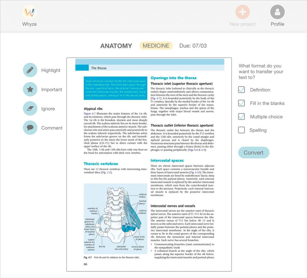
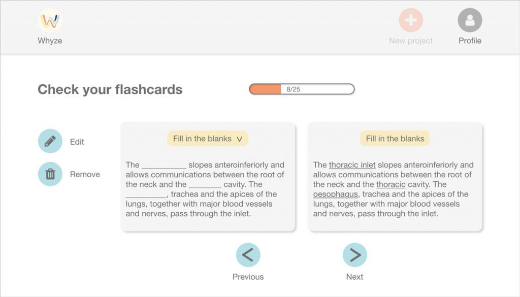
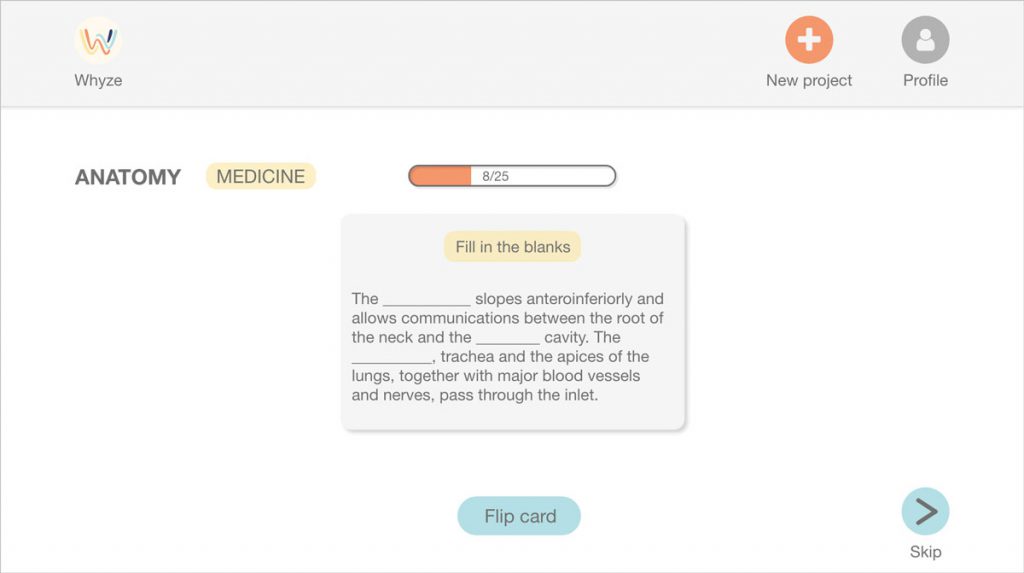
As part of the entrepreneurship competition Kickstart London, my team and I decided to tackle this problem by building the EdTech startup Whyze. Whyze makes use of scientifically proven learning techniques such as active recall. Using Artificial Intelligence, we can drastically shorten the process of creating materials as well as increase content retention for the users. On this page, I will focus on the research and design process of creating Whyze.
Process
Establishing product requirements
Interviews, Survey
Prototyping the product
Product concept generation, Wireframes, Interactive prototype
Branding and landing page
Visual identity, Logo, Landing page
Final solution
Lean canvas, Pitch Deck, Product concept
Establishing product requirements
We started the design process by conducting interviews with our main user group, university students, and later clustered our insights in the online whiteboard tool Stormboard. Through that, we learned that…
…students in their final year were set on their learning methods and showed little motivation in learning new tools or methods
…students mainly studied by rereading and highlighting
…different subjects required different learning methods. History students studied completely different from math students
To keep the first version of the product simple, we decided that our main user group would be students who need to study a lot of factual knowledge, for example medical students, rather than students who revise by practising exercises, for example math or computer science students.
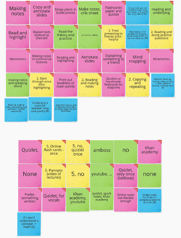
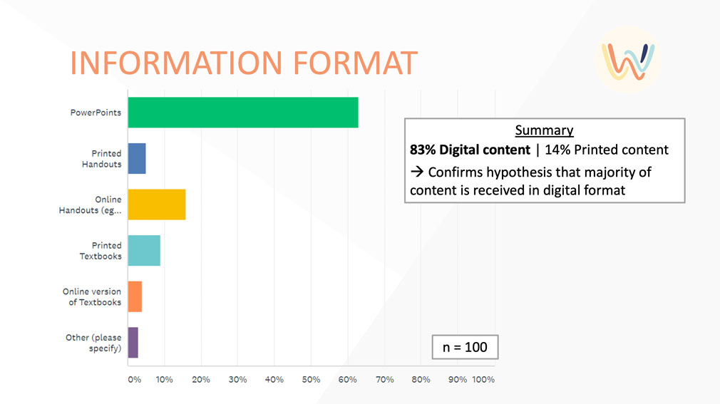
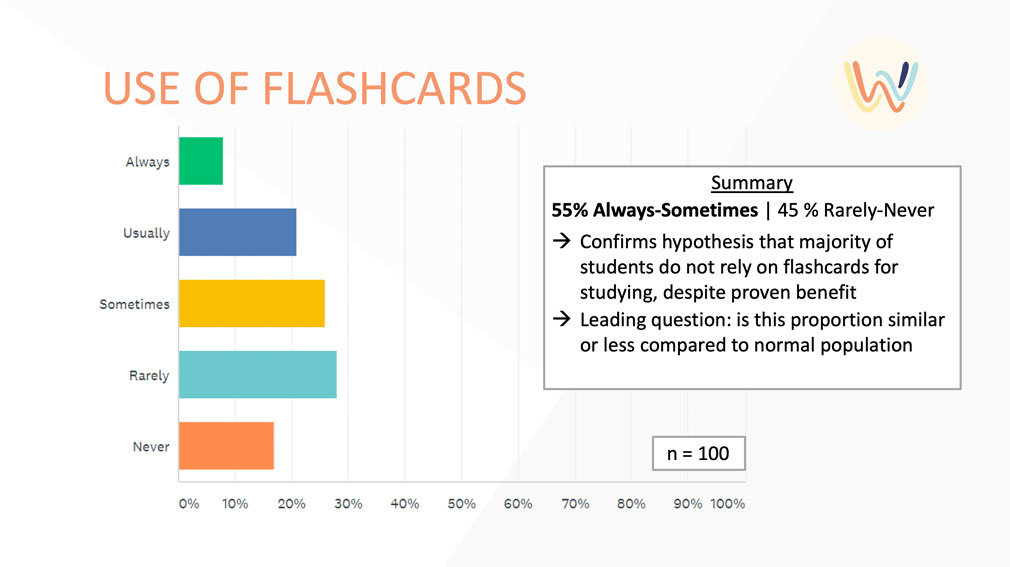
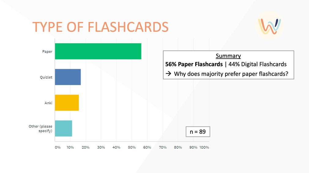
We complemented the insights we gathered from the interviews by conducting a survey. Using our university contacts we tried to reach medical students and gathered feedback from over a hundred medical students through an online questionnaire. We were especially interested in the formats students received their learning material in and if they created flashcards for studying.
Prototyping the product
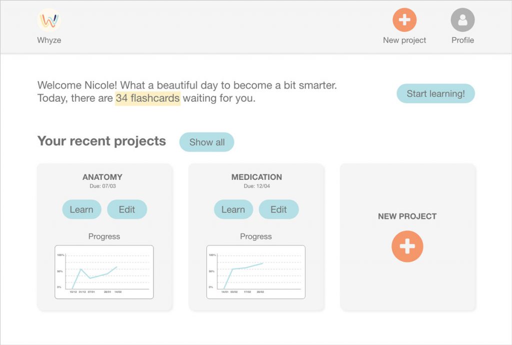
We believed in our vision, we knew our user group and scientific research suggested that the most productive way to learn was by active recall and spaced repetition, which we wanted to implement by automatically creating flashcards the user then learns in an optimally spaced rhythm. The next logical step was to define how the product actually looked like. This proved to be difficult. Even though everyone in our team had the same vision, the way we thought to implement it differed. Additionally, we all had the ideas in our head, but we didn't speak about detailed interactions, functions and screens. This is why we organized a product workshop, where every one of us described the user journey they envisioned for our product. A quasi-design-walkthrough, but without an existing prototype. Once every team member walked us through the product they had in their minds, we decided which of the functions were necessary for a minimum viable product.
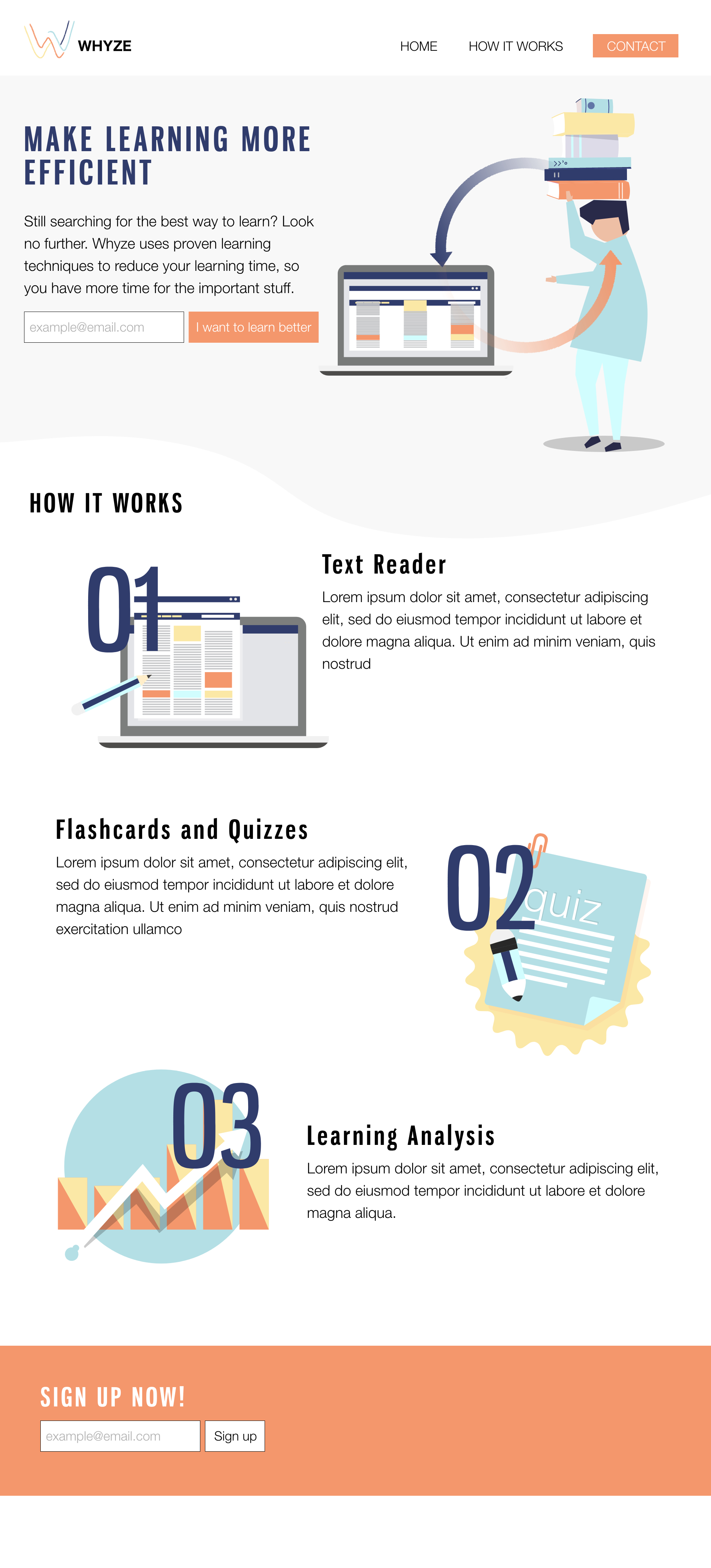
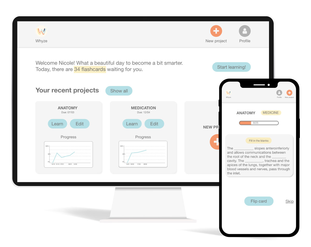
Once this concept was defined, I created the first product wireframes in Adobe XD. I decided to use Adobe XD because it is a lot faster than sketching paper prototypes and I could share results faster with my team. We knew that the final product would have a desktop version as well as a mobile version. I decided to prototype the desktop version first since I assumed that the process of uploading content and creating flashcards is more likely to be done on a big screen, though I haven't tested this assumption yet.
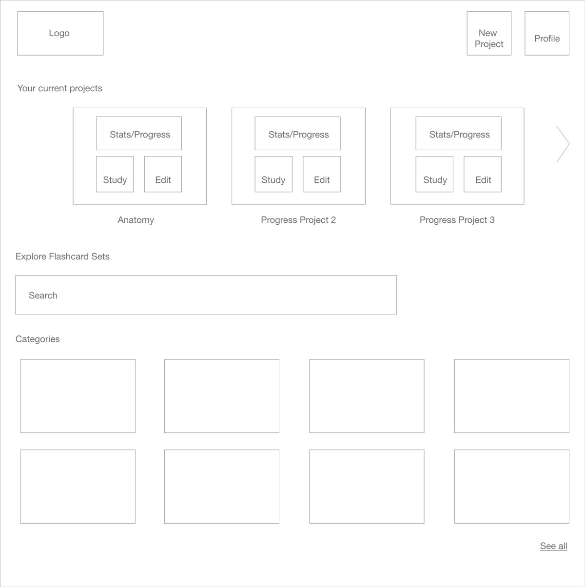
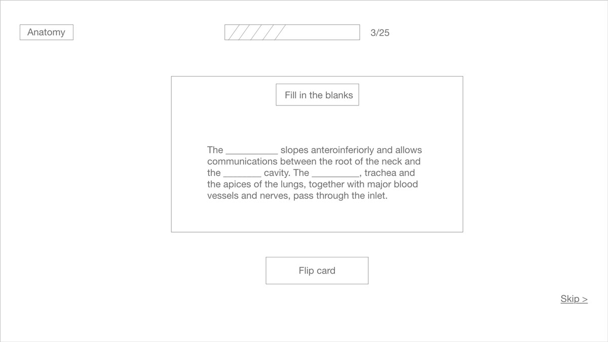
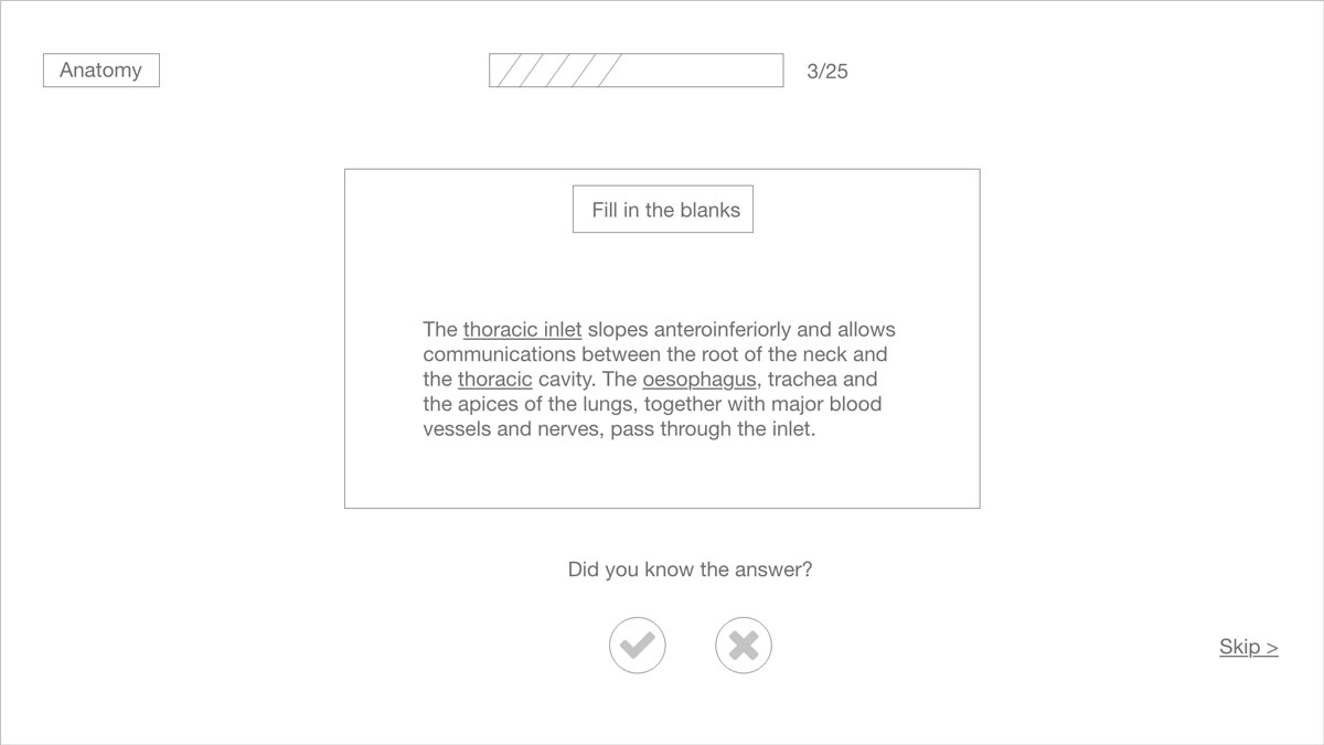
Based on the feedback from my team, I turned the wireframes into an interactive prototype with a polished user interface.
Note: I didn't conduct any usability tests while creating this prototype which would be a big issue if this was a real product. However, we wanted to have a prototype ready for the Kickstart London Demo Day which took place in March 2019 to demonstrate how our product would work. If this wouldn't have been the case, I would have taken the time to test an earlier version of the prototype and adjusted it to user feedback if necessary, before adding the visual design.
Branding and landing page
In our team, I was not only responsible for the UX design of the product but also for branding and marketing, including the design of a logo and a landing page. After we agreed on a colour scheme (we wanted Whyze to look fresh and energetic, but clean at the same time) I created a logo. We decided to not use one of the overused symbols for wisdom and education such as an owl, a brain or a graduation cap. Instead, we chose a simple "W". The final logo is the result of many iterations, as the image below shows.

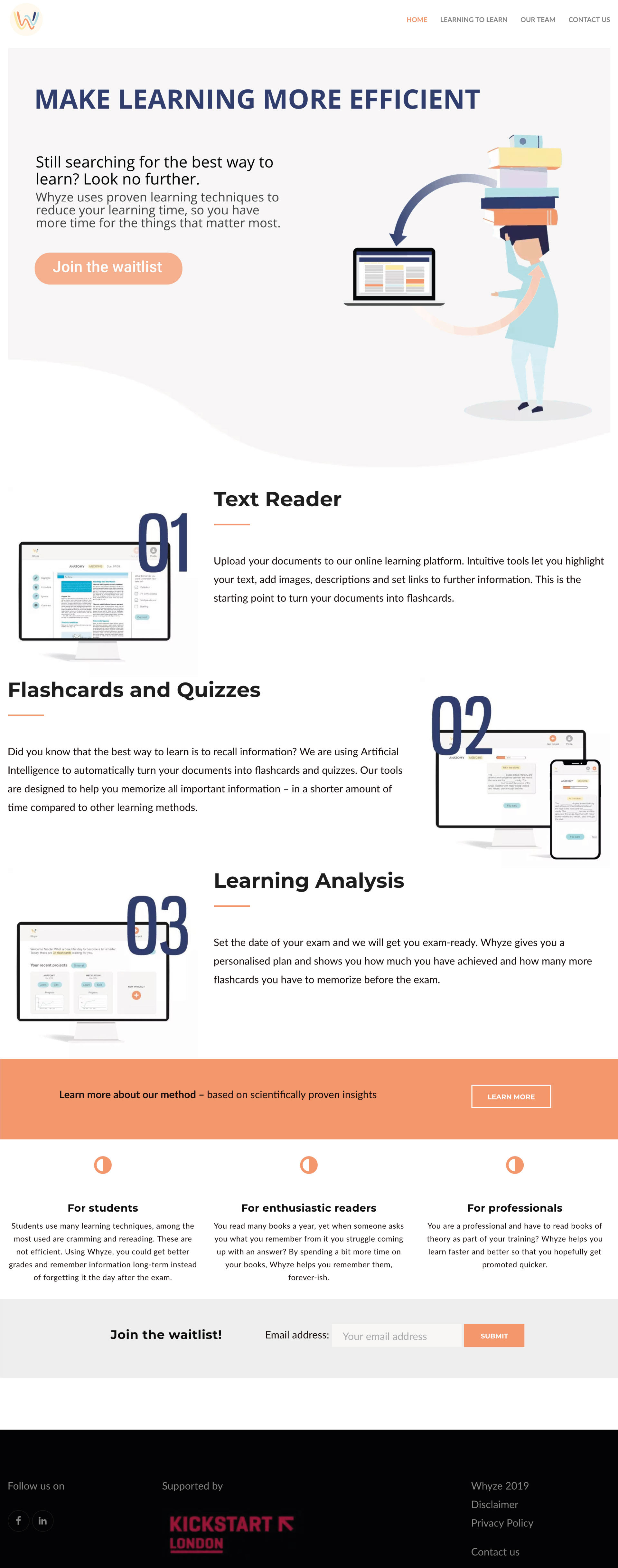
In parallel to creating the product, we were building a landing page to create initial interest for Whyze. While one of my team members was responsible for setting up the backend in Wordpress, I designed the website using Adobe XD. Similar to creating the product prototype, I first designed a wireframe version so I could discuss the structure and the content with the team, then I added the visual design. Finally, I rebuild my design in WordPress and wrote the necessary copy. Once the product prototype was ready, I exchanged the graphics on the website with mockups from the "real" product because I believe this will help the users understand the product better when visiting the landing page.
Final Solution
In addition to creating a product prototype and a first working version of the product, my team and I were also working on a lean canvas and a pitch deck which I don't want to withhold at this point because I believe business and design go hand in hand. We pitched Whyze in March 2019 in HubHub London, in front of entrepreneurs and startup investors and at the UCL innovation and enterprise Explore competition. I decided to stop working on Whyze in May 2019 for personal reasons.
What I learned
Many UX and UI methods are made for detailed interactions or are already based on an idea/hypothesis that you then test. With Whyze, we only had a broad vision that we had to turn in a product. I definitely learned how to make compromises. And even though the process looks structured on this page, in reality, it was a lot messier any many things were happening in parallel. The product basically changed daily.
I think now, with a first concept and sketches / a prototype, the real process of test – iterate – build could take place. This project showed me how different the work of a product designer can be, depending on the maturity of the product. Building a startup from scratch was a challenging and exciting experience and I can definitely see myself doing more of that.