Client
Campus London, a space for startups
Team
4 students with backgrounds in design, psychology and anthropology
Role
Researcher, Designer
Timeframe
September – December 2018
The challenge
Campus London is a co-working space created by Google. It builds upon the principles of a strong community and mutual support. However, finding the right people to collaborate with amongst a group of busy entrepreneurs can be challenging and time-consuming.
Our approach
As part of my MSc course in Human-Computer Interaction, my team and I decided to tackle this problem. Knowing that especially for introvert people approaching others doesn't come naturally and that it can be hard to find the right person to a specific question, we decided to simplify the first step of getting to know peoples' names and what they do. We brainstormed and evaluated different solutions before settling on the final prototype, an interactive dashboard.
Process
Establishing requirements
Observations, Interviews, Affinity diagram
Ideating
10x10 sketches, User feedback, Idea selection
Prototyping
Low-fidelity prototype, High-fidelity prototype, Heuristic evaluation
Final solution
Wizard-of-Oz video
Establishing Requirements
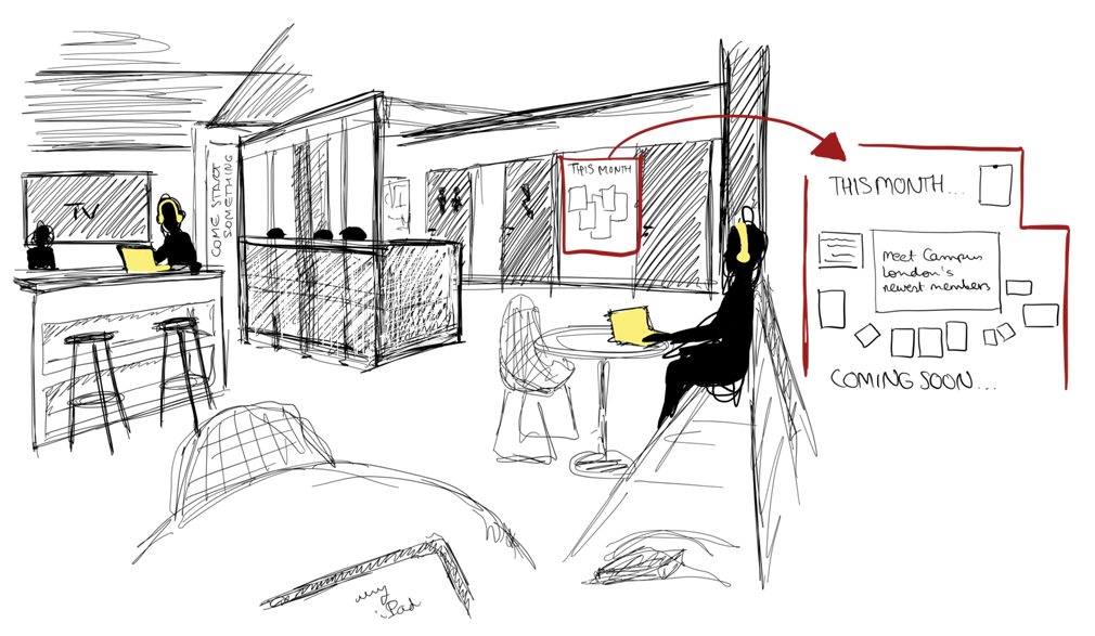
Our team started the design and research process by observing the co-working space. This way, we got a feeling for the internal dynamics of the space and the way the members interacted. One of my team members, Marina, made a drawing of the space to report back her impressions to the rest of the team.
Additionally, we conducted 11 semi-structured interviews with Campus Members to learn about their thoughts and troubles in their interactions with other people. To analyze the interviews, we created an affinity diagram. Findings show that Campus members struggle to identify who can help them with a problem and how to find the right opportunities to help. The interviews furthermore revealed that the main barriers to collaboration are the lack of knowledge of other members' skills and availability. Based on the interview findings, we defined the following requirements for the future system:
The product must…
- Facilitate asking and being asked for help
- Help members connect with strangers
- Allow for display of skills
- Reflect the Campus values
- Adapt to the availability of members
- Allow specific requests and questions
- Be engaging
- Avoid the possibility of spam

Ideating
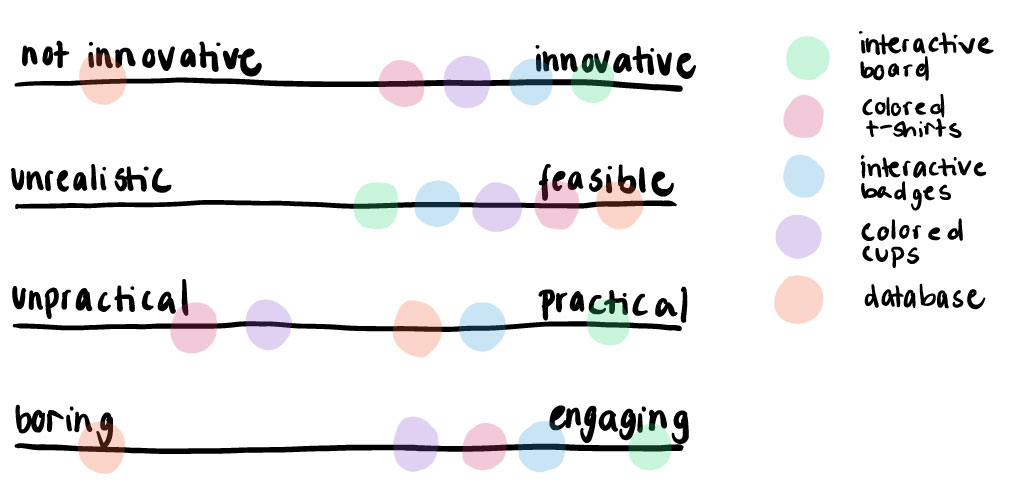
We used these requirements as a starting point for our ideation process. That in turn, we started by doing 10x10 sketches, meaning everyone in our team had 10 minutes to sketch 10 different ideas. I highly value this technique since it enables you to think out of the box and not settle on the most obvious or common solution already in the beginning. We then took these raw sketches back to our community to get their feedback on it, even before we made a pre-selection. After the very insightful user feedback, we defined four scales on which we classified the five most promising ideas so that our first prototype would not be based just on gut-feeling but on actual deliberation.

We decided to prototype an interactive dashboard, which showed you present members and their skills. We assessed that this would meet the user requirements, but the effort for users would be minimal.
Prototyping
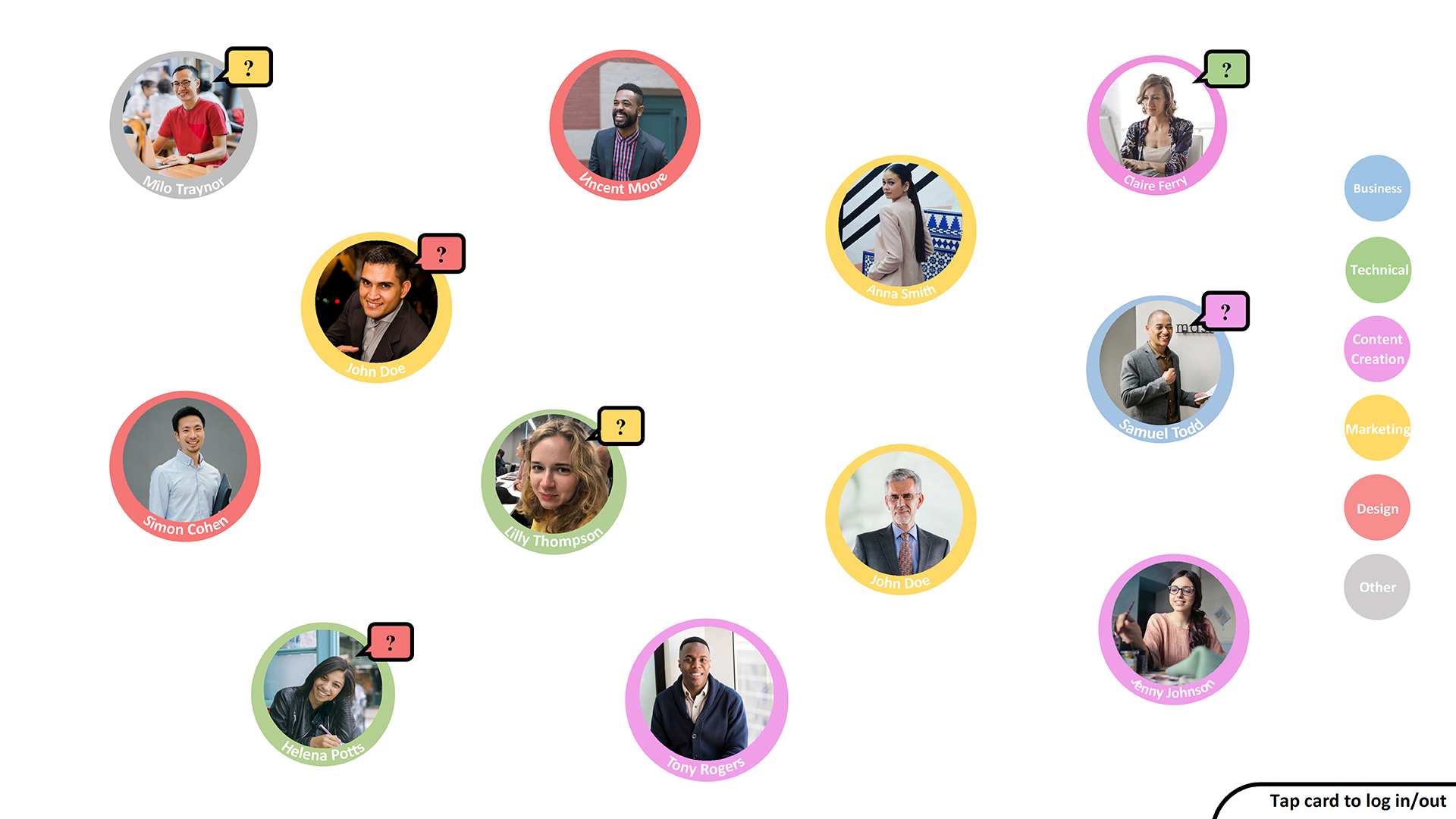
We built an early prototype of the dashboard using pen and paper. The first version of the prototype would show the members' profile in a distinct colour based on their background/main skill. To be shown on the board, you had to log in every morning when you were present in Campus. Through this, we wanted to reduce the number of spam requests that were common in traditional communication channels. To enable more meaningful conversations, members could post their questions to the board so that other members could directly answer.
We tested this early prototype with three participants we recruited from the Campus community. Feedback was overwhelmingly positive. In addition to small usability problems we also took away the following learnings:
- Users wanted to filter for skill
- Not only profiles, but questions should also be colour-coded based on category as well

Based on the paper prototype and the findings from the user tests, we built a high-fidelity, interactive version of our campus dashboard in Adobe XD. To examine our board for further usability issues, we conducted a heuristic evaluation based on Nielsen's heuristics with five UX experts that weren't part of the core team. The main problem that was found was that the logging into the board was not clear enough yet, even though we tried to model it after the popular "tapping in" of London public transport.
Final Solution
To present our findings, we created a Wizard-of-Oz prototype using a big TV screen, a human operator and a test user. We believe that with our solution, CampusBoard, members of Campus London will have an easier time to connect with other people in the Campus, get help if they experience problems and give back to the community. The video will describe how our solution works and how it will fit into the Campus in more detail.
What's Next?
The next step in the development of the CampusBoard would be to design a clear visual identity that reflects the design of Campus London as well as to build the technical infrastructure. It is recommended to build a minimum working version of the product first and do another round of iterations.
Additionally, this project only focused on the design of the dashboard and neglected to study a necessary accompanying software solution through which members can create their profiles and post questions.

